mathspace checkpoints
I was the lead designer on this project, and worked on it for most of 2020 during my time at mathspace. The project was later renamed to waypoints.
motivation
Mathspace was looking to seed some more rapid growth opportunities alongside the steady growth provided from our core product. A couple of years earlier we had hacked together a MVP for a diagnostic assessment product, and it had been relatively successful, so we used this as an indicator that the diagnostic space may be a good starting point for a new product.
investigating the real problem space
After engaging with the reasons that led to this piece of work, we headed to the problem space accompanying diagnostic assessment tools with the goal of improving our understanding of what problems people are usually trying to solve with them. From this research we developed a problem statement:
For a typical teacher, too much time, resources and energy are required to simultaneously track each student’s level of understanding, provide them with individualised support, and maintain the ability to report on their performance in a standardised way.
It was clear that teachers used diagnostic tools with the hope of saving time required to report to a rigid set of standards, as well as to help inform them of the varied landscape of student understanding in their classroom over the course of the year. Many existing diagnostic tools failed to solve this problem, for 3 keys reasons:
- Too time consuming to conduct the assessment (we had some reports of 2 weeks of class time being lost for students, 3 times per year).
- Results became irrelevant by the time they were delievered, sometimes having half a year delay between assessment and delivery. So much could have changed for a student in this time.
- Assessments were too infrequent to be useful day to day.
From these key points, we developed a UVP to focus our first MVP around:
For math teachers who want to spend more time focused on the individual needs of students, we’ve made a continuous assessment tool that provides unobtrusive tracking of student journeys through any math curriculum.
We had also formed two other UVPs that touched on other pain points, but decided to focus our efforts on one UVP at a time in order to make a near-term MVP more achievable.
At this point I made a Figma prototype that would communicate the value we were trying to offer, so we could get feedback on it from teachers and students.
We got a lot of feedback. Some of the common points included:
- Some sort of growth tracking is valuable for teachers, but they don't have any specific presentation of growth in mind.
- The ease of use implied by the prototype is valuable for teachers.
- The adaptive nature of the test is valuable to teachers.
- The ability to see areas where students are weak is valuable for teachers.
- The ability to quickly group students in their class together is valuable to teachers.
- The ability to see whether a cohort is on average performing above/below/at grade level is useful for HOM/Decision makers.
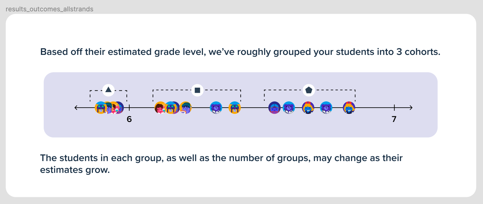
- Teachers really like the heatmap grid (Gutman chart) on the Outcomes page.
- The more grade levels the diagnosis can span, the more valuable it is for teachers.
- Being able to prove that our tracking is accurate will be important to HOM/Decision makers. (For example, analysing correlation between performance on our tool against a national assessment)
getting started building
Before getting the whole product team involved, I made a context doc to get everyone up to speed on the work that had led us to this point. On previous projects I had found this transparency helped eliminate foundational gaps in the team's understanding of why we were building a product or feature, and prevented these gaps from festering into a lack of product alignment within the team later down the track.
This document then evolved as the project went on, with the hope of keeping the team aligned even when people weren't in a particular meeting or were sick for a few days. I can't include everything from that document in my portfolio, but here are some random excerpts to help you get a feel for the things we tracked:
- Are we building a product from scratch or a new feature for Mathspace?
- What parts of existing Mathspace will we leverage?
- The point was raised that we may not need a backend at all for the prototype, and could model everything on the client side.
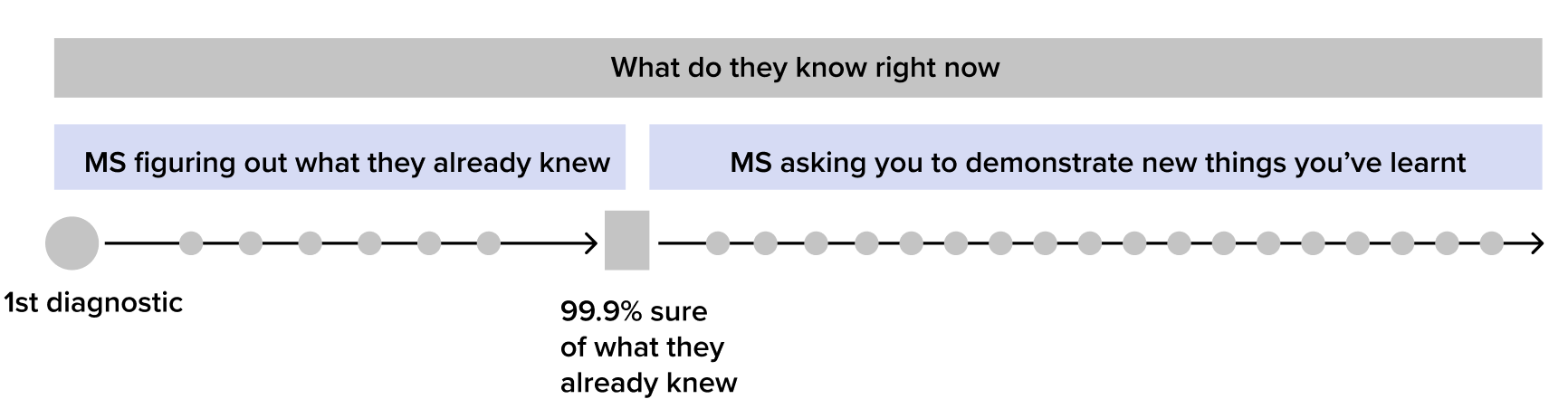
- There are still some big unknowns yet to be figured out for the project. One big one is what level of confidence we can get for a student in 60 (or X) questions. How many questions would we need to have 50% confidence in our diagnosis? 80% confidence? 99.9% confidence? And what should our threshold be? This should be something to start exploring now.
- To clarify, this is just a mental model for thinking about what the check-ins are trying to do. This structure doesn’t necessarily have to be reflected in the product itself.
- Today we had a long grooming meeting to take stock of what we’ve achieved/done so far this sprint and what the immediate next steps are.
- We confirmed we will continue just working from a paper doc rather than trying to put everything into Jira.
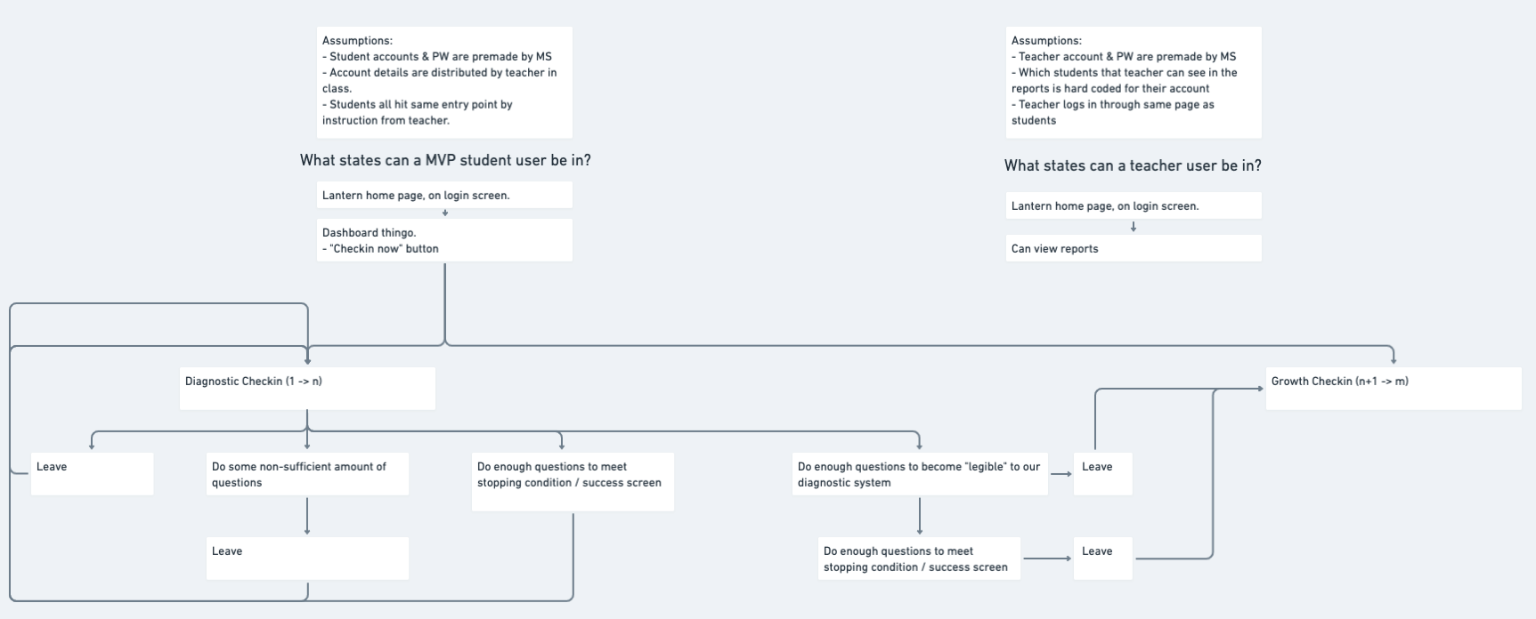
- For now, we’re going to go with the following flow for check ins.
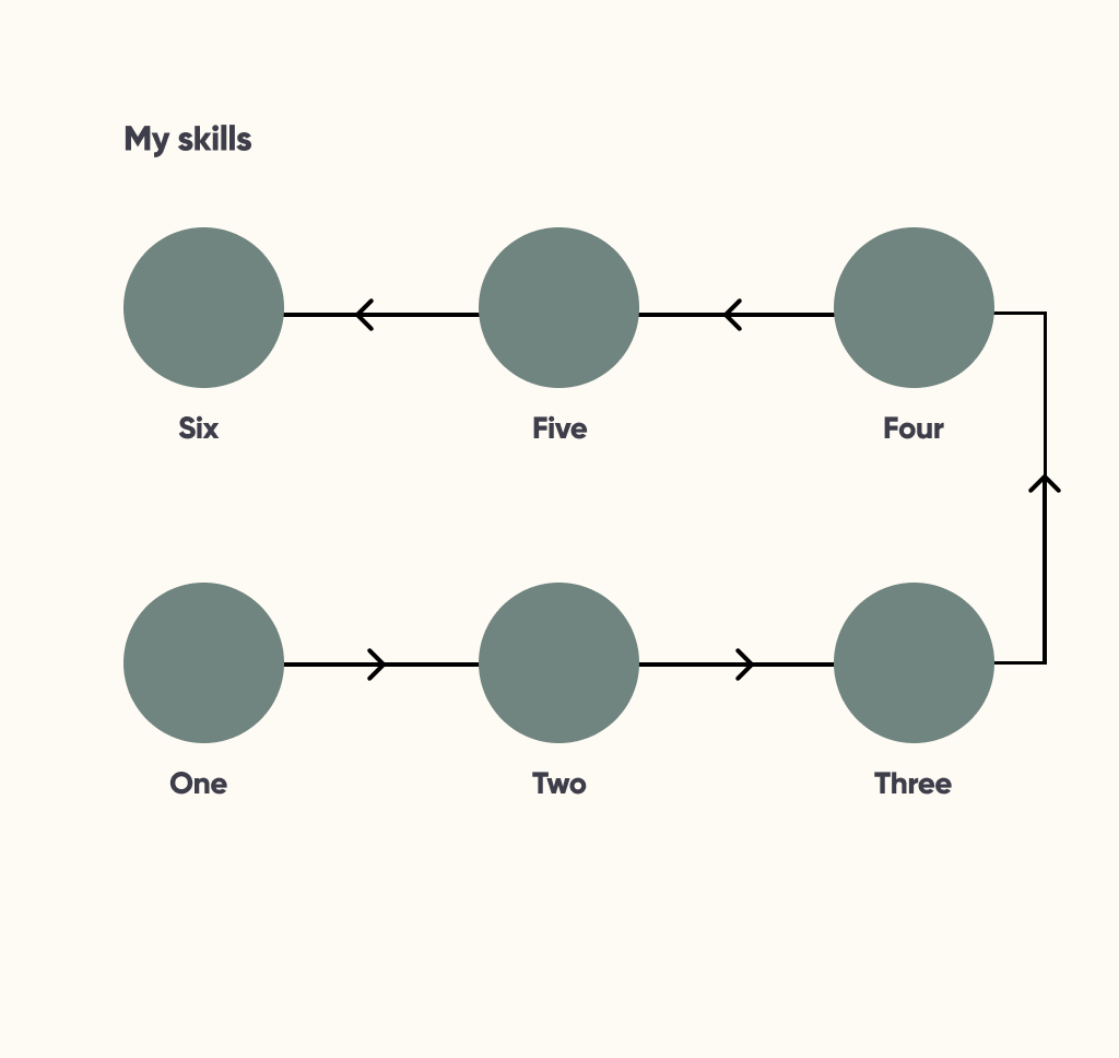
Up until this point, UI design was of lowest priority. As a result the app looked something like this:
This was good enough for testing early versions of the product, but the time was rapidly approaching when we would have to figure out the visual language we wanted to use during further development.
establishing pillars for design
With a UVP to work towards, I set up some design pillars that were based in the rich feedback and domain knowledge we'd gathered during discovery. These would help our product team make consistent design decisions throughout early development as more and more people became involved.
How do we want the product to feel when someone uses it?
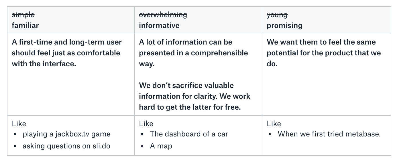
Some other points we wanted to follow, based off of learnings from previous projects:
- We want to make it as hard as possible to get off track. Reduce space to wander.
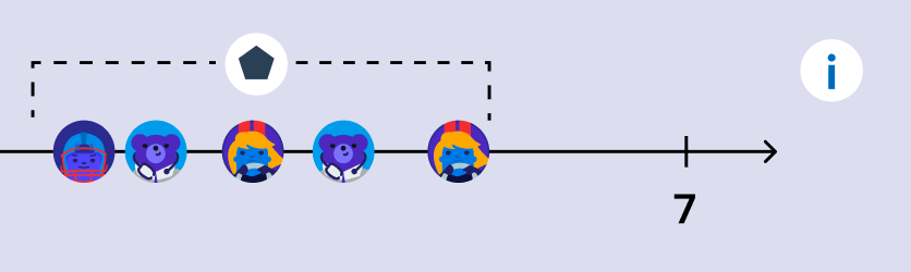
- Students need a responsive sense of progress. Make the goals for progress short. These goals can be frequent if necessary. Clearly show some evidence of student’s efforts. I.e.
- Be as frank & transparent as we can when communicating with the user, whilst remaining positive.
- We don’t assume understanding of anything non-trivial, and we should really lower our bar for what is considered trivial. An explanation is never far away, easy to locate, and spacially adjacent to the feature it is explaining.


early artefacts
Okay, so we have some design pillars and and UVP to try and deliver. We knew that our product had to communicate progress across an entire math curriculum, so now to answer some more focused questions related to that.
- What might be an engaging way to display the math curriculum to students?
- What might be meaningful interactions that students could have with the math curriculum?
- What might be a useful way to display the students' proficiency on the math curriculum?
- What might be a useful way to display skills that have not been mastered?
- What role should goals play in the representation?
- How similar should the individual view be to the aggregate or class view?
- Should all skills/outcomes be treated equally (rather than weighting them)?
We had some assumptions to validate as well:
- Students get value out of being able to visualise the math curriculum.
- Students don't relate to outcome definitions so we need to display skills with more approachable definitions instead.
- Students will feel overwhelmed if they see the complete curriculum so we need to support progressive navigation.
From our research, we couldn't find many examples of products doing a good job of visualising a complex network of interconnected skills, and representing a student's progress in mastering them. Often they were just too large to be comprehensible, or completely non-visual. From here I just decided to play around with some directions to get a better feel for how they might work.
node based skill networks
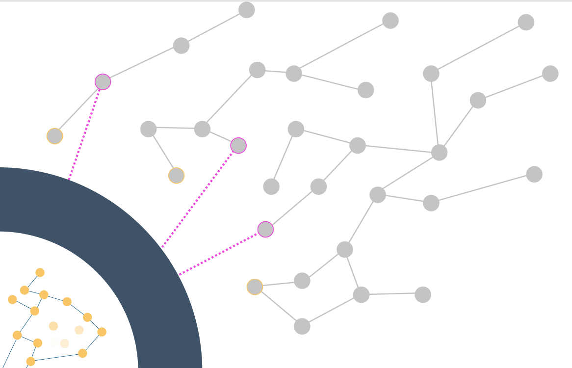
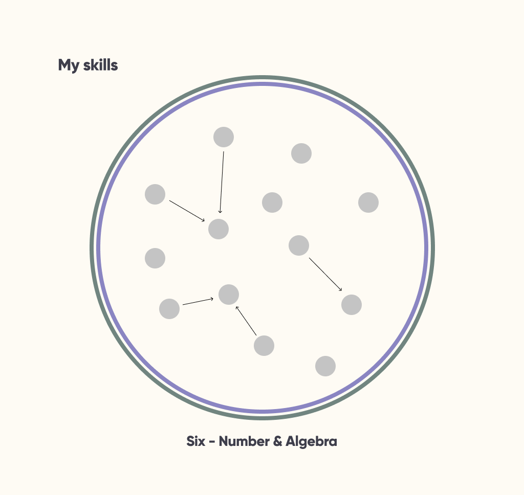
positive
- closely maps to the modelling we use for a curriculum behind the scenes
- relationships between skills are fully preserved
- similar to other representations of curricula we found; familiarity is good for learning a new tool
other
- idea of a skill tree may be overwhelming for students
- hard to compare two reports at a glance
- probably more effort required to make these representations scale to smaller devices
- within a given grade level there may not be that many connections
list of skills
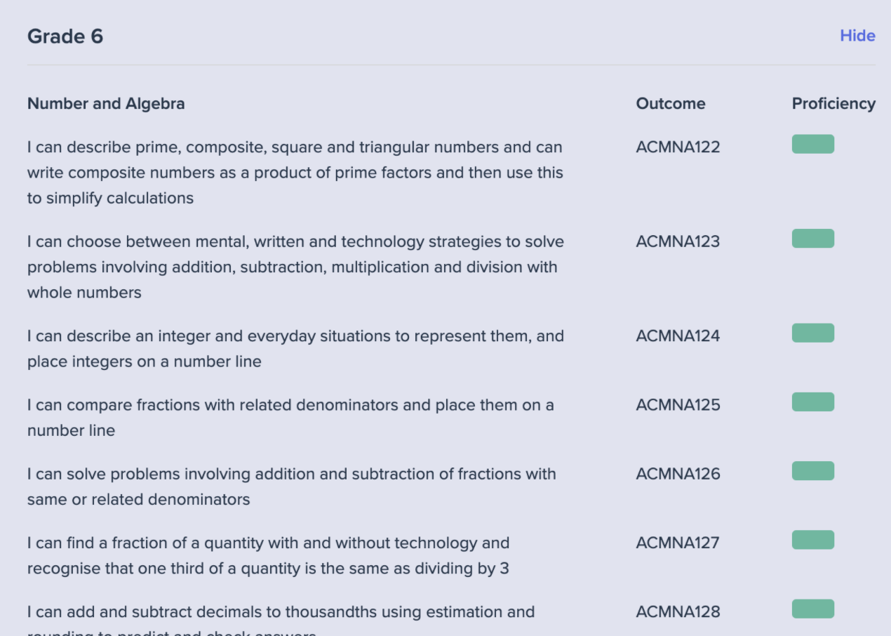
positive
- easy to implement
- proficiencies are easily associated with skill
- skills have clear link with outcomes
- can easily scale to small devices
other
- relationship between skills is completely lost
- hard to compare two reports at a glance
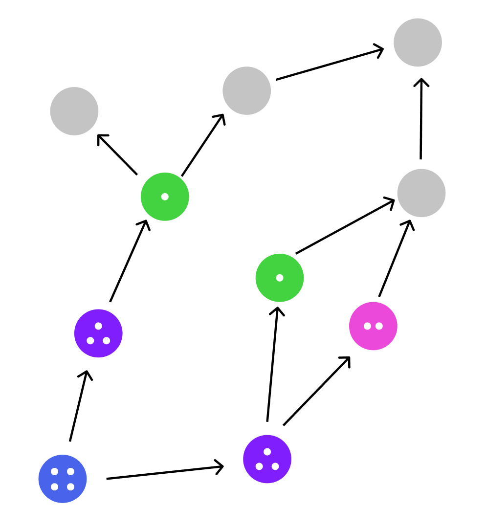
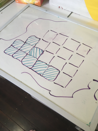
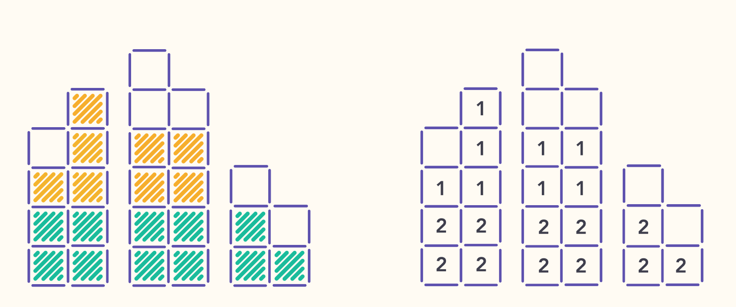
skill blocks
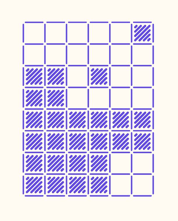
positive
- grid based representation should scale better across devices
- easy to visually identify locations of foundational gaps
- building block notion reinforces the foundational nature of mathematical skills
- quick to compare two skill reports
- reduces the entire curriculum into a bite-size visual artefact, that can be referenced easily outside the product
other
- feels focused on completion rather than growth
- not clear how you would represent progress
- pattern should scale across different curricula
- some connections between skills are not represented.
- colours could easily be replaced with icons or symbols whilst still preserving the ability to see gaps
deciding a visual direction
Of the ideas I'd explored, the skill blocks felt the best. So I started re-desiging the UIs we'd built with this new visual language in mind.
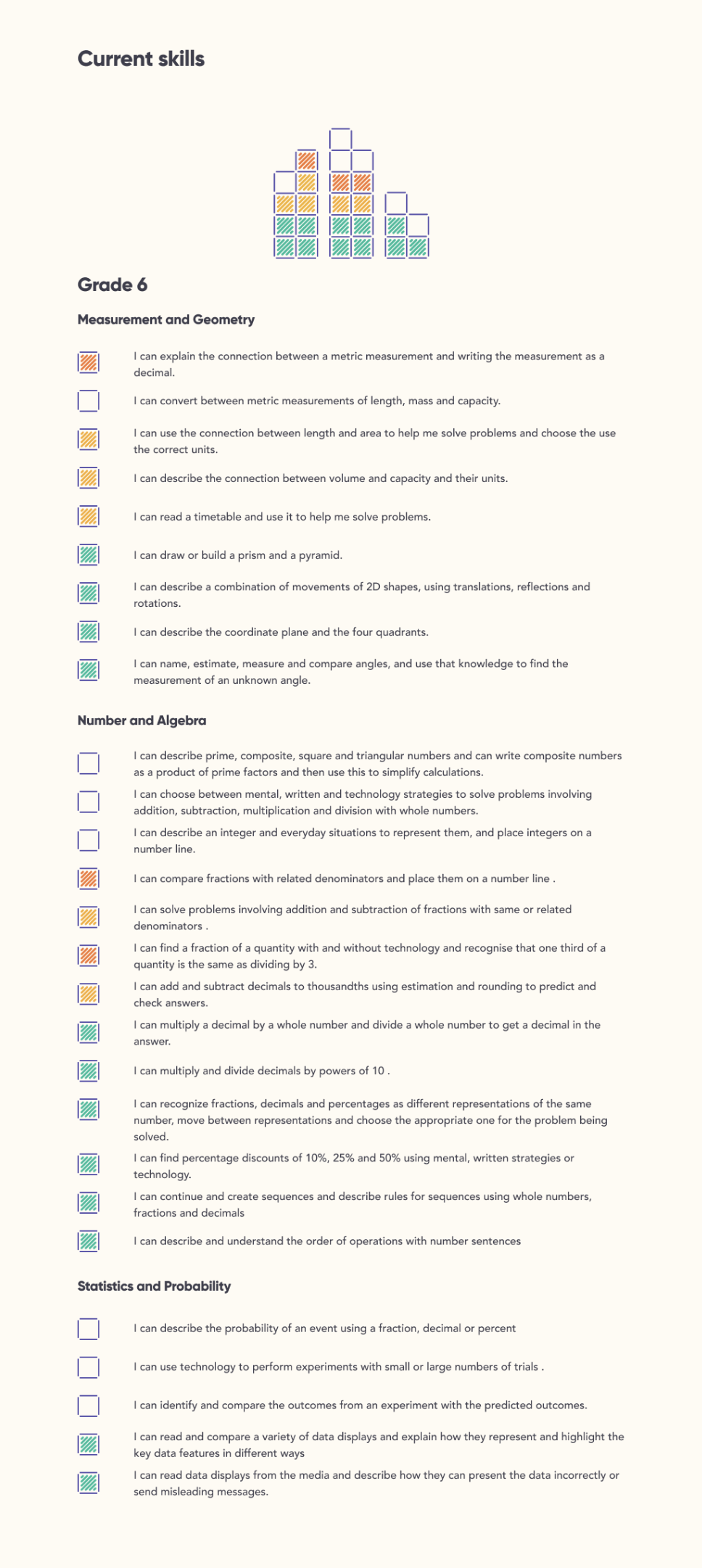
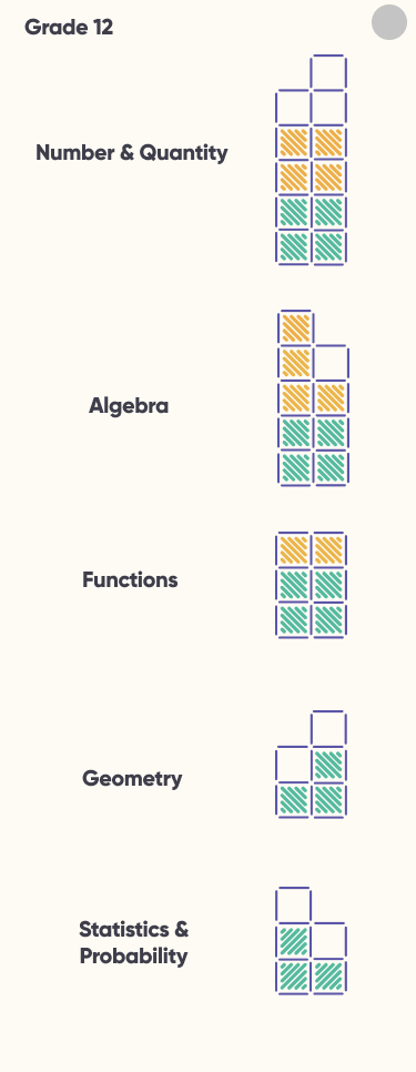
At this point I created new prototypes and interfaces to help guide our team to the next version of the app.
continued iteration
By now we had onboarded many classes to beta test the product with, and I was meeting virtually with at least 1-2 classrooms every single day of the week to check-in on them and deliver insights back to the rest of the product team. We used dovetail to help track all our feedback.
The iterating was still ongoing when I decided to leave the team to start my next project. I am proud of how well the project went from the early discovery phase, all the way up to how it was looking as a full-functioning beta product. It is exciting to reflect on the small part this product may play in moving towards a world free of high-stakes exams.
You can track the latest progress on the project here.